
My Role
Lead Product Designer, Design Mentor
Team
Project Manager, Development Team, 2 Junior Designers
Problem
Caseware couldn’t render 30,000+ account groups took a few mins to load, costing an estimated $10–50M in lost enterprise deals annually.
Solution
Refactored 3 core interfaces — data visualization, configuration workflows, and risk identification — introducing a scalable List view, bulk management, and an optimized risk review experience.
Impact
10× data scalability
60% faster setup
3 enterprise clients secured
Uncovering Technical and System Complexity
Part 1 : How would we enhance the visuals to support scalability?
Our starting point was the existing graph visualization used for trial balance reports. The introduction of fund reporting mandated a solution to scale this component, as it required handling significantly larger, multi-level organizational hierarchies in a user-friendly way.
Current Issues
Interface was missing zoom in/out functionality required to manage and interpret extensive data
Inconsistency with menu options and user messages
No search capability
Interface needed visual update for improved usability
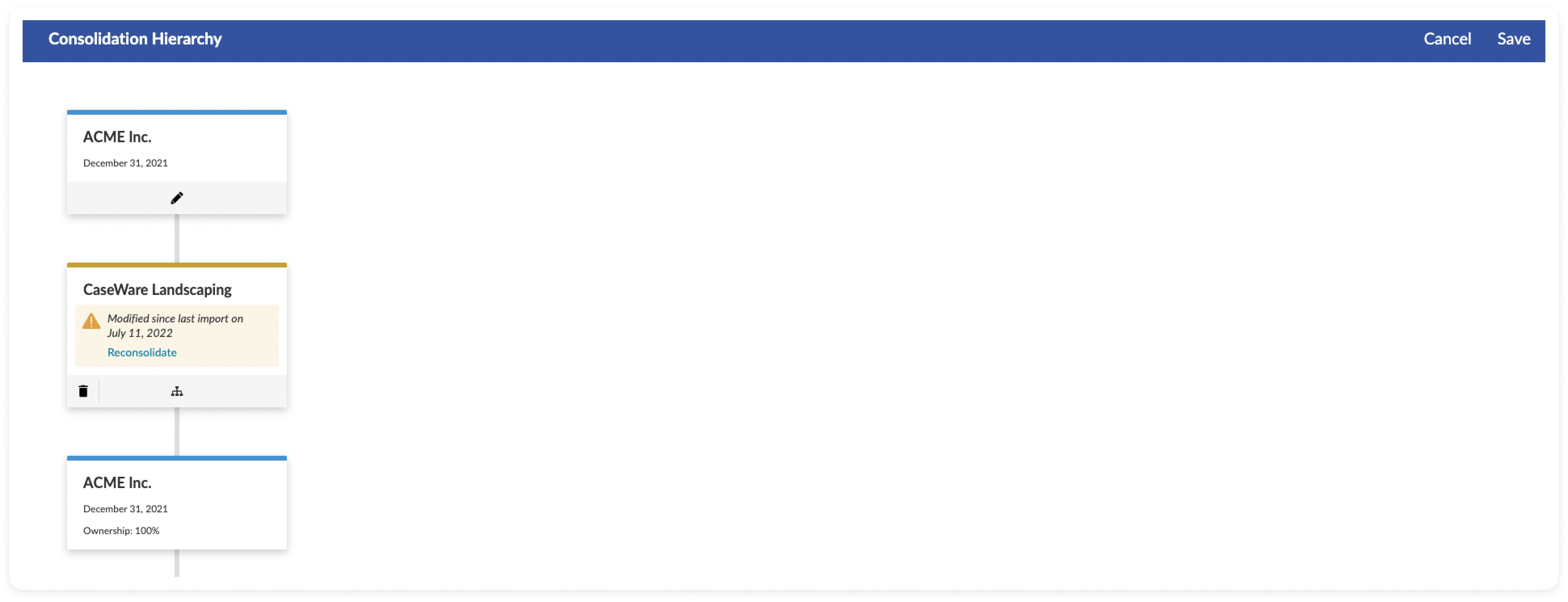
Existing Interface
Data Driven Synthesis and Intentional Design
The solution began with a deep synthesis phase, translating qualitative user insights into data modeling and visualization requirements essential for large-scale data efficiency.
Defining Critical Data Density
User interviews with 5 users rapidly established that reviewers prioritize a handful of data points for rapid triage before diving into detail.
These requirements became the constraints for the new card design, ensuring density without visual noise:
Firm Name: Primary identifier.
Ownership %: Key financial relationship metric.
Year-End Date: Critical for audit scheduling and jurisdictional compliance.
Engagement Status: A binary signal (Caseware Linked / External Data), vital for managing data import workflow risks.

Card view explorations
Optimizing Layout for Scale
Early testing showed the standard vertical layout wouldn't work for the massive amount of data in fund reporting. We chose a horizontal layout because it aligns with the user's existing mental model and significantly improved how many cards could be viewed on the screen, which was critical for managing large datasets.

Chart view explorations
The Grid vs Graph Dilemma
Rendering 30,000+ hierarchical nodes in the Graph View proved computationally difficult, generating unacceptable load times of over 10 seconds and creating potential blocker for enterprise adoption.
The decision to introduce the Grid View wasn't a feature addition; it was a strategic design intervention to solve a critical platform performance crisis at scale.
This technical compromise allowed us to meet the < 2 seconds load time requirement for the largest client datasets, successfully transforming a technical constraint into a scalable, high-performance solution for the reviewer workflow.
Final Designs

Accounting firms hierarchical graph view

Accounting firms hierarchical grid view
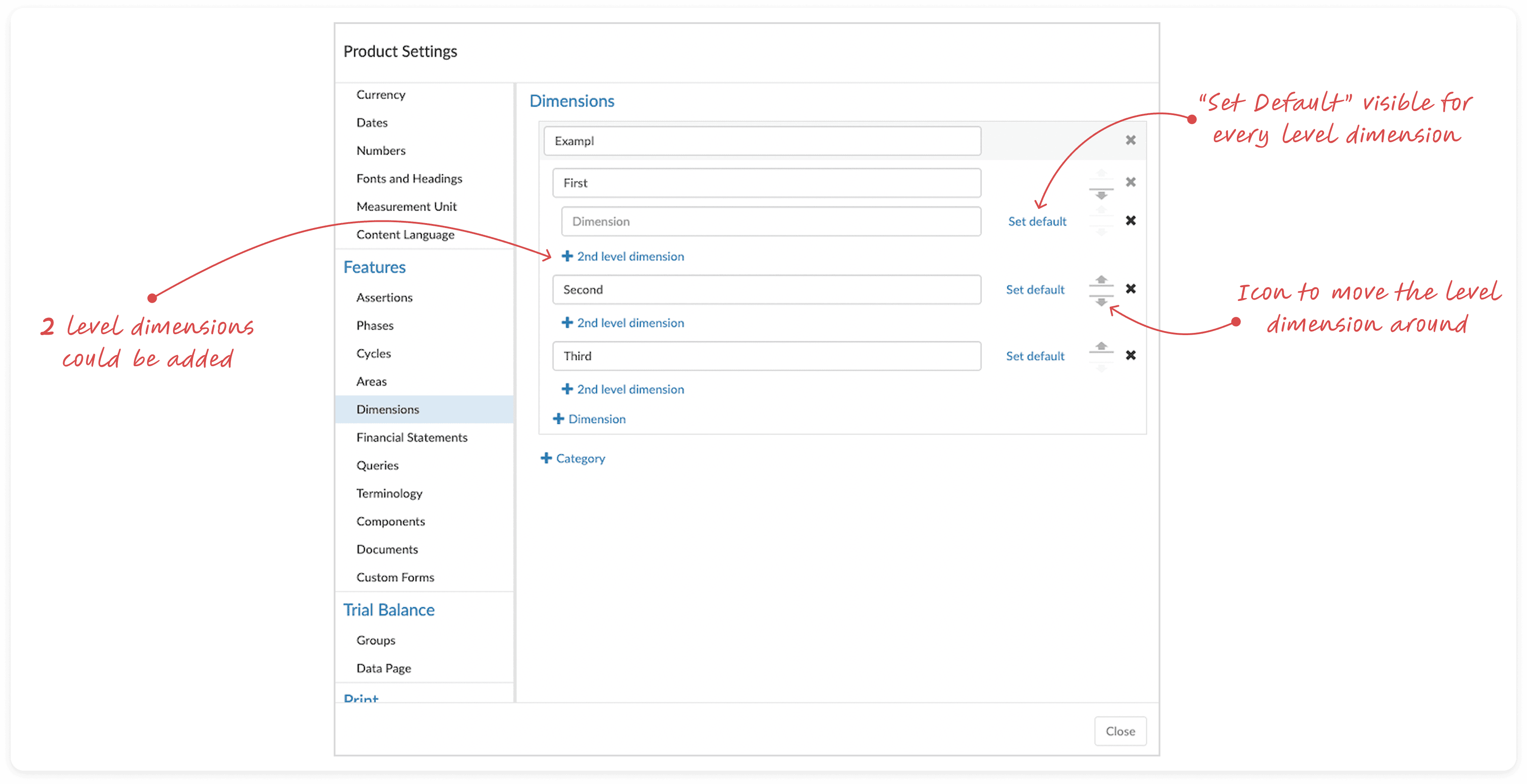
Part 2 : Data Configuration Enhancements for Scalability
This interface was another critical component that focused on the configuration of categories and dimensions for large-scale reports.
This is not just updating a UI. It is a data configuration challenge where the interface must support complex, many-to-many relationships across potentially tens of thousands of account groups.
In a nutshell:
There can be many categories
Each category can have multiple dimensions with multiple levels
Categories and dimensions must be assigned to multiple account groups
Problem: Efficiency Debt at Scale
The existing workflow was built for small datasets as a source of "efficiency debt". For large enterprise clients, manually assigning categories and managing complex hierarchies became a bottleneck, resulting in:
Repetitive Effort: Assigning these configurations required property edits for each accounting group.
Cognitive Load: The lack of bulk controls made managing the complexity of multiple categories, each with multi-level dimensions, tedious and error-prone.
Adoption Barrier: This inefficiency made the Cloud setup process significantly slower than legacy solutions.
Existing interface for setting up dimensions
Strategic Solutions
My design strategy was to focus on centralized bulk management instead of individual property edits of accounting groups. The solutions were directly targeted at high-volume pain points:
Inline Group Assignment |
|
Centralized Default Setting |
|
Drag and Drop Interaction |
|
By tackling the efficiency of bulk group assignment, we inherently designed for solving the blocker for creating dimensions more than 2 levels.
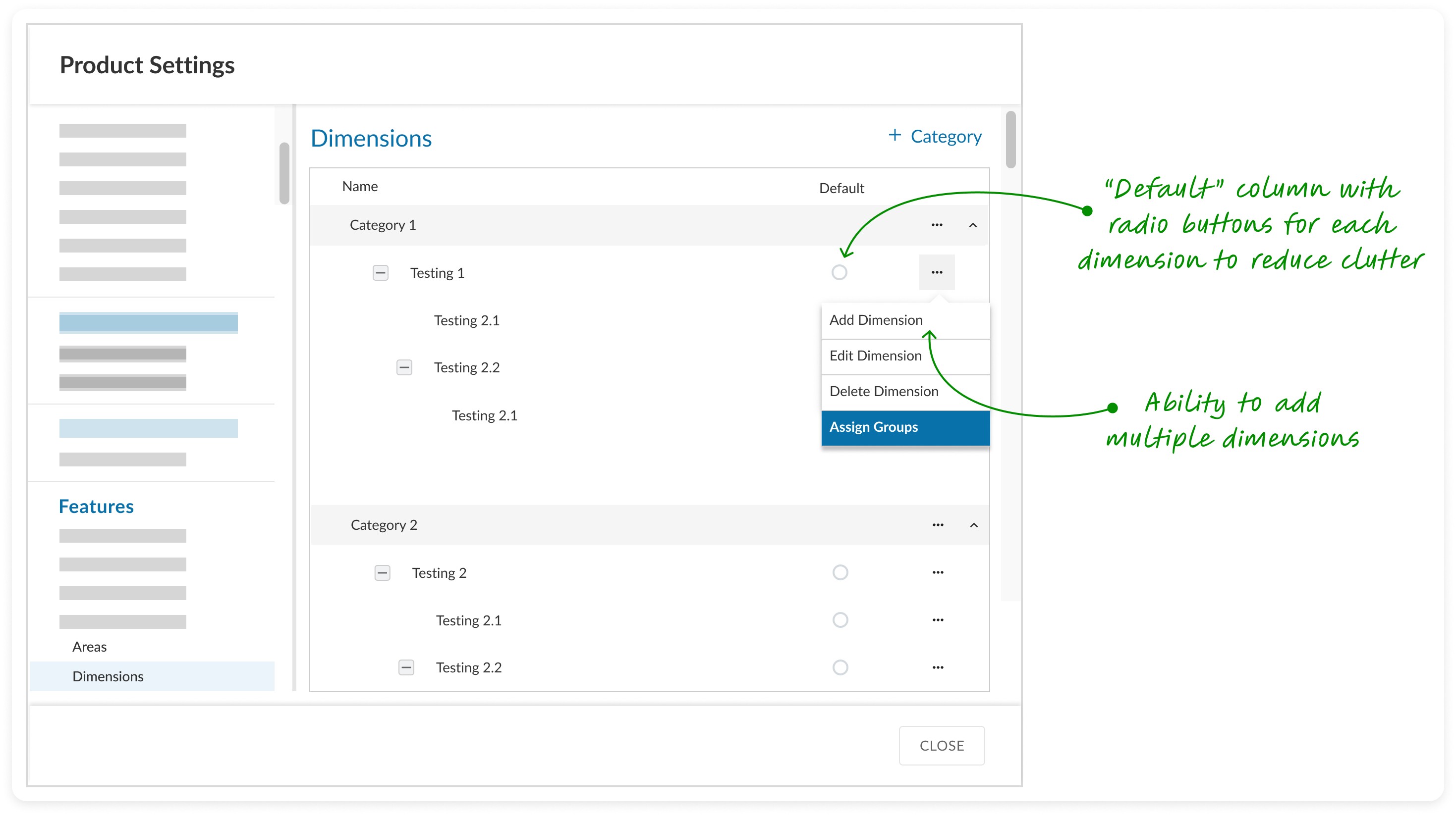
Dialog box to setup categories and dimensions before user feedback

Dialog box to setup categories and dimensions
Wrapping Up
This redesign transformed a scalability bottleneck into a high-efficiency configuration experience, directly supporting the project's goal of enhancing user efficiency while working with large datasets.
Part 3 : Risk identification at enterprise scale
The final stage focused on ensuring that the scalability project did not compromise on data integrity - a mandatory step of Risk Identification within the auditor's workflow.
Challenge: Information density vs limited real estate
Risk identification is critical for auditing, but the UI had to support a single risk being associated with an exponentially larger number of accounting groups due to the new fund hierarchy structure. Combining this with limited real estate because of standardized designed components and ensuring usability, increased the complexity.
Solution:
My approach was to optimize the existing design system patterns to accommodate the new data scale, focusing on rapid triage and review process:
Collapsed View Optimization: I restructured the risk card layout to divide its content into two distinct, scannable sections. This strategic segmentation improved the readability and information hierarchy of the risk summary, allowing reviewers to do quick assessments.
Impact: Improved overall velocity of the risk review workflow

Collapsed view optimization
Expanded View Optimization: For the detailed view, I prioritized pattern consistency. Ensuring that users can now associate a risk to a large number of accounting groups without having to edit individual properties.
Impact: Reduced cognitive load during configuring and investigating phases.
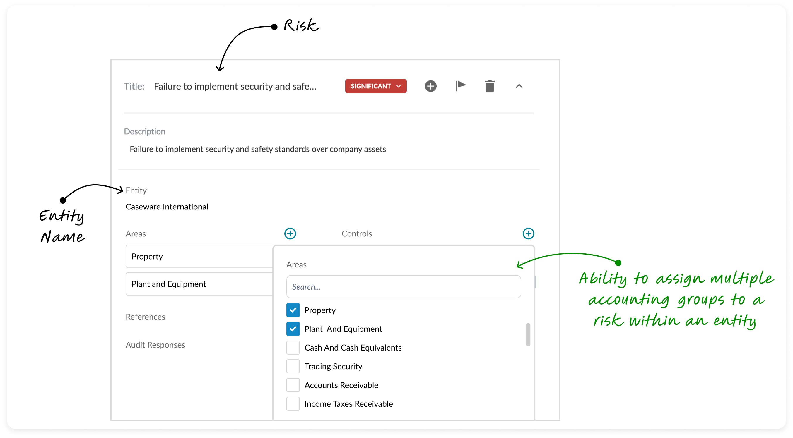
Expanded view optimization
With this work, the auditor's mandatory process of identifying and assessing risk made the review process efficient, clear and improved usability.
Measurable Impact
The project launched successfully in 2024, and the subsequent performance data confirms that the design solutions not only addressed the immediate pain points but delivered on the core strategic platform goals for scalability and efficiency.

System scalability: improved 10X in data handling capacity
The final designs rendered a dataset of 30,000 account groups with target performance of < 2 seconds load time.
Efficiency: User productivity improved by 60%
The redesign of the dimensional configuration workflow resulted in a 60% reduction in setup time for assigning accounting groups. By minimizing clicks and converting an hours-long task into a minutes-long process, the design dramatically enhanced user efficiency. This was a key driver for Caseware Cloud adoption by three large fund reporting clients.
Learnings
The importance of gaining a holistic understanding of the problem
This project affected multiple interfaces across the system, each with unique user requirements.
By persistently seeking answers and collaborating with the right people, I was able to connect the dots and develop tailored solutions for these challenges.
Bridging design and engineering
After conceptualizing the design solution, I shifted to an engineering perspective to evaluate its integration with existing systems.
This approach allowed me to define the project's scope effectively and propose practical solutions that aligned with both business goals and development feasibility.
Impact from my design leadership
Guiding junior designers on this project required time and patience to bridge the gap between business knowledge and design skills.
Seeing the new designers gain confidence by the end of the project was a fulfilling moment and a testament to the power of strong design leadership.


Let's connect
I'm not just here to design products; I'm here to connect with people.
As a product designer, I'm on an exciting journey to blend creativity with technology to craft memorable user experiences.