B2B Trade-In Feature: Scaling Enterprise Data Entry

Summary
Problem
Rogers Direct, the B2B portal where businesses order cellular products with corporate discounts, needed a device trade-in feature. Store managers and dealers trade in dozens of devices at once, each with its own condition parameters, and nobody wants to re-key the same data 50 times.
Solution
- Grid-based bulk data entry, built for the Excel mindset
- Duplicate-row action + CSV/Excel upload to the grid
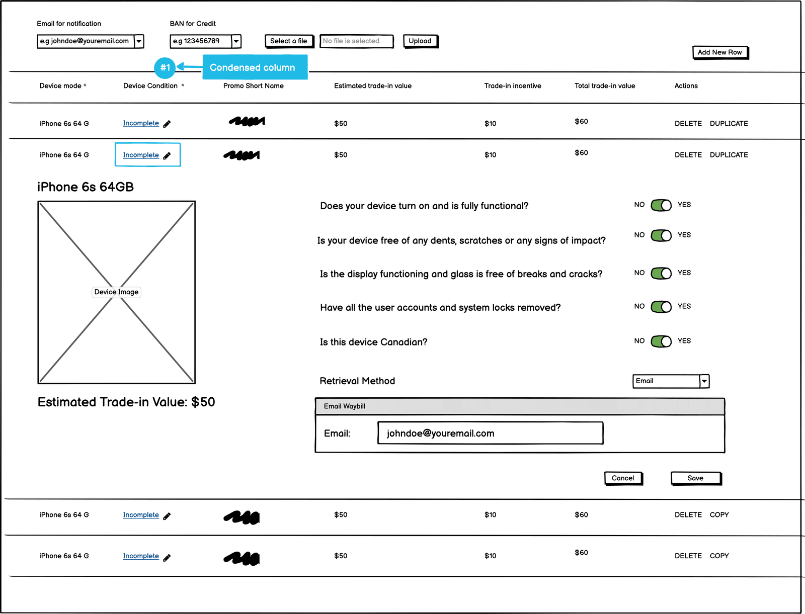
- Device questionnaire condensed into one “Incomplete” validation column
- Promotions carousel + “How to trade-in” infographics before the flow
Impact
- 80% reduction in manual data entry via CSV bulk uploads
- 10x faster processing for multi-device enterprise trade-ins
- Zero-error data capture achieved by consolidating mandatory fields
Project Context
Rogers Communications Inc. is Canada’s largest telecommunications and media company. Rogers Direct is its B2B portal for small, medium, and large businesses to place orders for cellular products and services with corporate discounts. We were tasked with designing a device trade-in feature, integrated into the existing purchase order flows and as a standalone application across different Rogers B2B software applications.
User Goal
Ability to trade-in devices in bulk.
Business Goal
Trade-in available as a standalone feature and integrated in the purchase order flow.
Designing Inside Real-World Constraints
This enterprise-level application had to present tons of information for this feature, while staying implementable within the development timeline. The stakeholders noted the user base came from varied demographics and educational backgrounds, so every interaction had to strike a balance between quick data entry and familiarity. Combine that with limited real estate and all the mandatory fields required by the business, and the problem becomes much more complex.
- Varied demographics: Wide age ranges and educational backgrounds ruled out modern-but-unfamiliar interactions like 3-way sliders.
- Limited real estate: Promotions and infographics had to fit on top of an already dense data-entry grid.
- Mandatory fields: The business required responses for every device parameter: nothing could be quietly dropped.
- Feasibility first: Designs had to ship within the dev timeline: no over-engineering.
Three Challenges, Three Solutions
After landing on a fairly intuitive wireframe direction, bringing it to life surfaced three distinct challenges, each answered with a deliberate design decision.
Challenge 01
Bulk Trade-In, Per-Device Control
The challenge
Users wanted to trade in multiple devices in bulk, and still change individual parameters for each device, without repeating data entry for devices with the same responses. A store manager trading in 50 identical devices should never edit all 50 by hand, but must be able to adjust any one of them.
The solution
A grid approach: each row is a device, each column a parameter, most beneficial for users coming from an Excel mindset. A duplicate-row action removes redundant entry, and for dealers handling tens of devices at once, data uploads straight into the grid from CSV or Excel files.

Challenge 02
Validating Required Fields in Bulk Uploads
The challenge
Enforce user input for required fields. When users bulk-upload a lot of records, validating them against the source is very difficult: missing a response or two could lead to an inaccurate trade-in amount.
The solution
After a few whiteboard sessions and testing with internal users, we combined the device questionnaire into a single sophisticated column showing “Incomplete” as a status, with an option to edit responses, a grid with fewer columns, so users aren’t overwhelmed by data presented all at once.
Challenge 03
Promoting the Feature, Onboarding the User
The challenge
Mid-project, the Rogers team added a requirement to show trade-in promotions and offers. Meanwhile the support team raised a concern: users entering the trade-in flow had no way to know the next steps after submitting their information.
The solution
A carousel shows 3 promotions at a time with an option to see more, attention without overwhelming the interface. And right before users dive into the trade-in process, a trade-in infographics section gives a brief visual explainer of the steps.
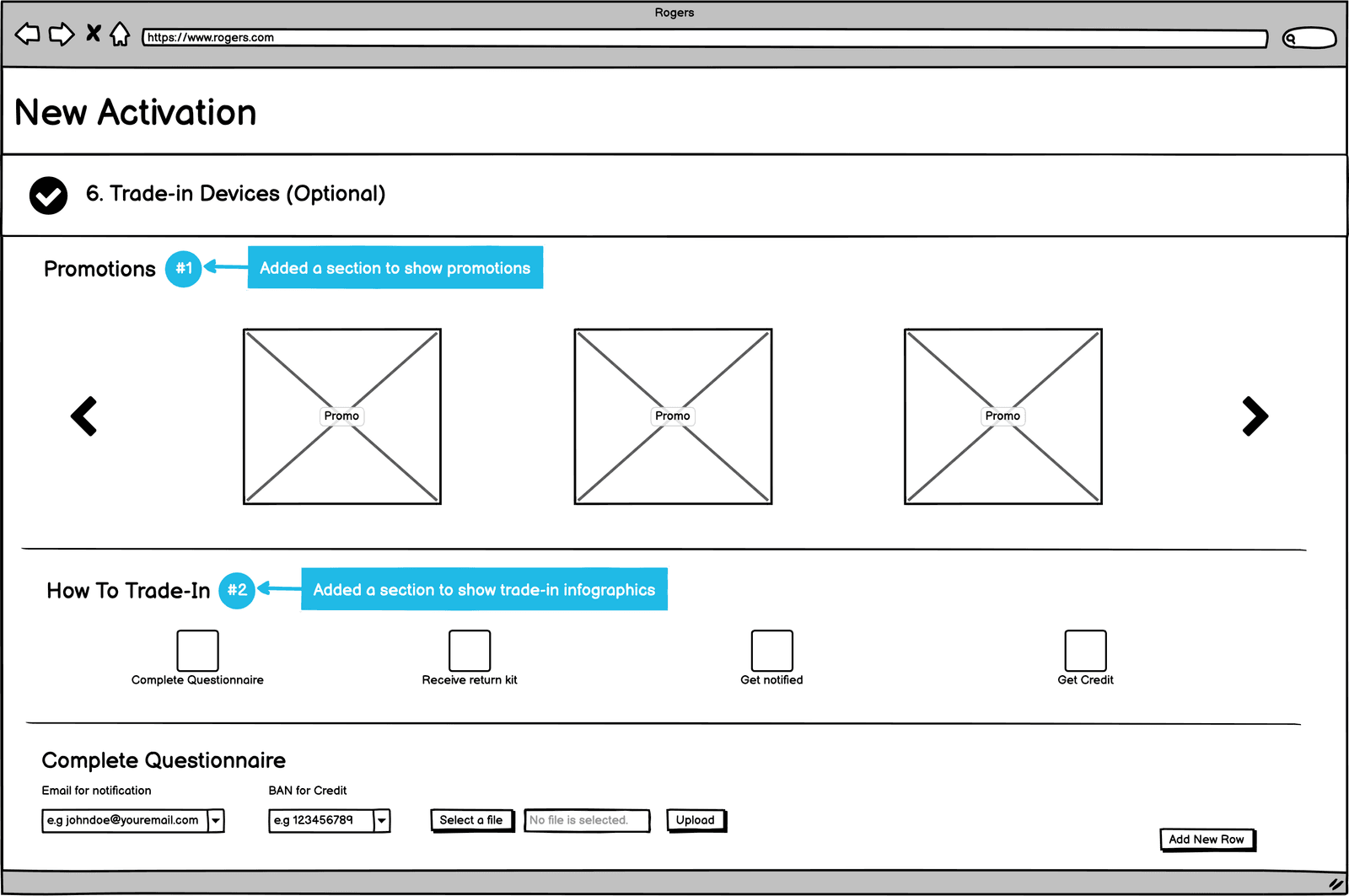
Adding this tiny but powerful section into the interface made a huge difference for the team.
Final Designs
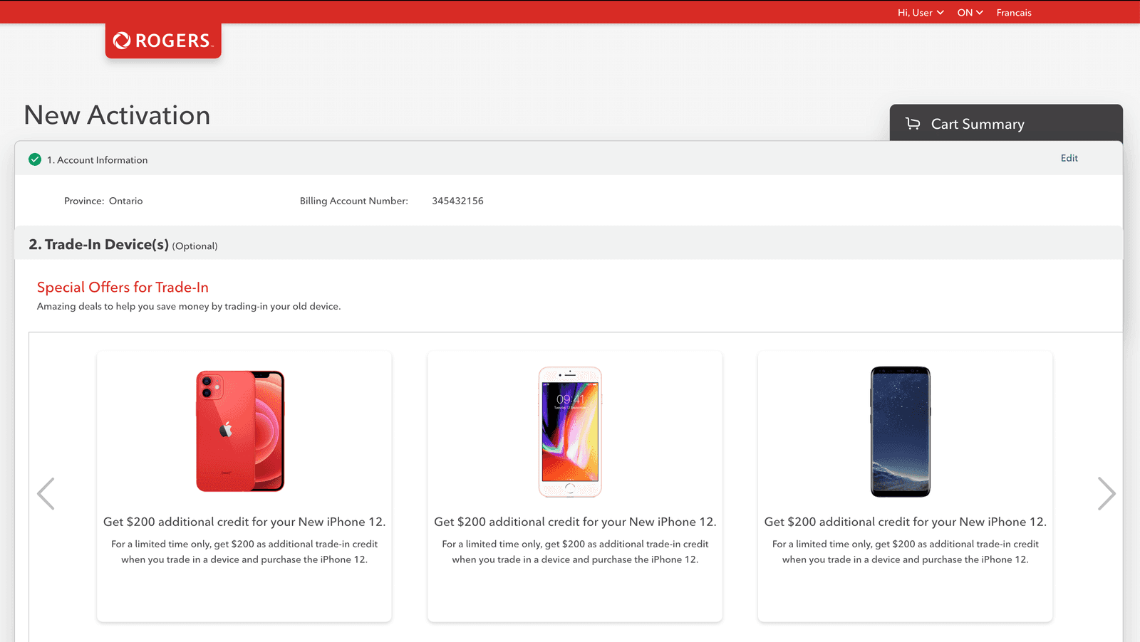
The shipped trade-in step inside the New Activation purchase flow: promotions up front, the grid behind it, everything within Rogers’ design language.
Key Takeaways & Learnings
Designing for the Excel Mindset
Grids fit enterprise bulk entry
Users who live in Excel respond to table-based interactions. Fighting that mental model only adds friction.
Duplicate row is underrated
Simple to build, enormous time savings for repetitive data. The smallest features can carry a workflow.
Modular design absorbs scope changes
The promotions carousel and infographic landed mid-project without breaking the core grid pattern.
Demographics are a design constraint
An older, varied user base limited modern UI patterns like sliders. Conservative, universal interactions won.
Enterprise complexity, bulk purchase flows, multiple parameters per device, limited real estate, demands interactions designed carefully around how users already work, not how we wish they would.