Streamlining Product Search & Discovery
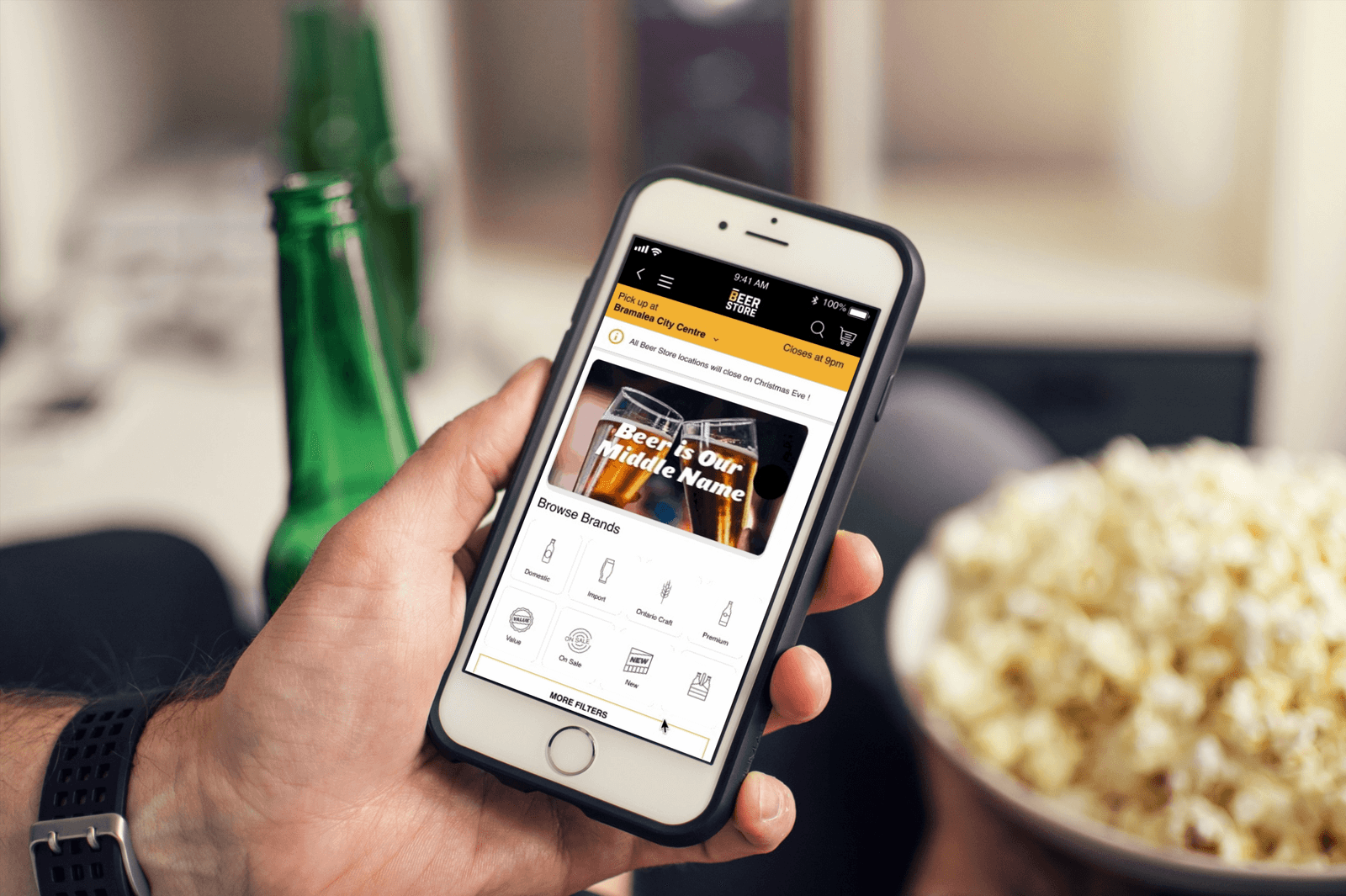
Summary
Problem
The Beer Store’s mobile app made criteria-based discovery painfully slow. Users couldn’t find beers by style, type, or recommendation. The existing search flow was cumbersome, often taking over 3 minutes and sending users into frustration and abandonment.
Solution
- “More Filters” entry point right on the home screen
- Popular categories in a quick pop-up sheet
- Second-level drill-downs for specific criteria
- Applied filters always visible on results
Impact
- 75% faster product discovery: reduced from 3+ minutes to under 45 seconds
- 60% reduction in screen transitions to find a specific product
Project Context
The Beer Store is a privately owned chain of retail outlets selling beer and other malt beverages in Ontario, Canada. Customers use its web and mobile applications to order drinks online for delivery or in-store pickup. This project focused on the mobile app’s search experience, on a hard one-week timeline.
The Three-Minute Search
The core problem was a limited search experience. End-users could not easily find beers based on specific criteria or recommendations. The existing flow was cumbersome, often taking over three minutes and leading to user frustration and potential abandonment.
Objective: Integrate richer product attributes into the mobile app’s search feature to simplify discovery while maintaining an easy-to-use interface.
Project constraints
- Tight deadline: Time was a major constraint for the entire design and development cycle: one week from research to dev-ready designs.
- Technical limitations: Restricted from drastic changes to the existing UI/UX so the development team could meet the deadline.
- Design mandate: The constraints pointed one way: minimal, high-impact changes only, not a redesign.
From Journey Maps to Benchmarks
My research focused on understanding the user’s struggle and the competitive landscape, guided by three questions:
- What are the steps users take to locate a product?
- What is the average time required to find a product?
- What are the primary pain points encountered during the search process?
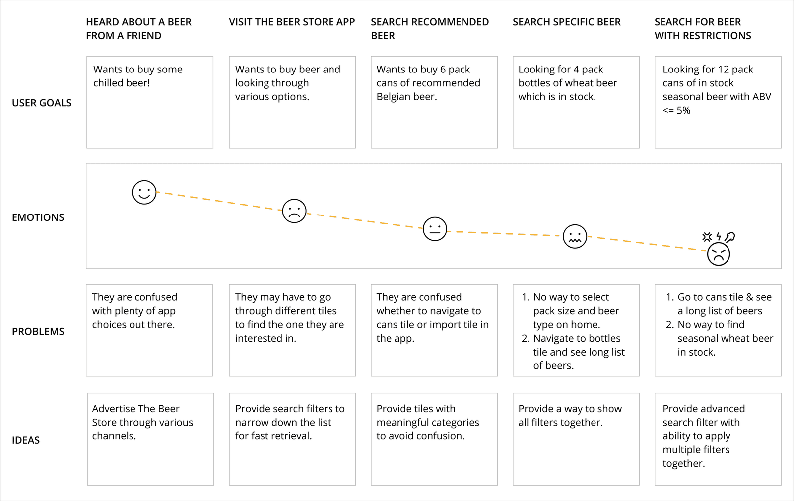
Current-State Journey Mapping
Mapping the current search flow revealed that pain points escalated significantly when a user attempted to search using specific criteria. From there, so many variables could go wrong, affecting how long the flow takes and how much success the user will have. A time-consuming process (over 3+ minutes) that can send a new user or prospective client into a whirlwind of frustration.
Competitive Analysis
Next, I compared The Beer Store app with existing and related products in the retail space: searching for a great speaker on Amazon, a German beer from LCBO, a local restaurant on Yelp. For apps like LCBO or TBS, users usually visit to find a variety of beers recommended by friends or co-workers, something difficult to do by visiting a brewery or pub. I set out to design an experience tailored exclusively to fill this gap.
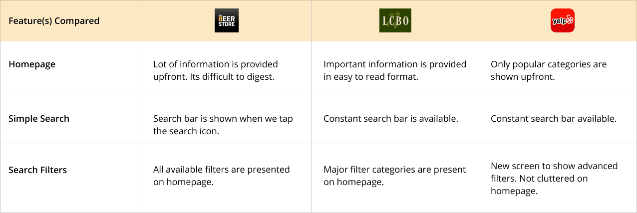
Users come to these apps to find beers recommended by friends and co-workers, a specific, criteria-driven need the app completely failed to support.
What the audit reinforced
- Limited search options: Lack of sophisticated filters or product attributes.
- Time consumption: The process takes too long for users to locate products.
- Inconsistent experience: Discrepancies between the web and mobile app search features.
Minimal Changes, Maximum Impact
After validating the need and gathering the categories along with their priorities, I sketched a few solutions in Balsamiq and presented them to the team early. This led to good discussions and a faster understanding of requirements between internal and external teams. The four screens below read as one flow: the whole redesign in a single scroll.
01
Easy access from home
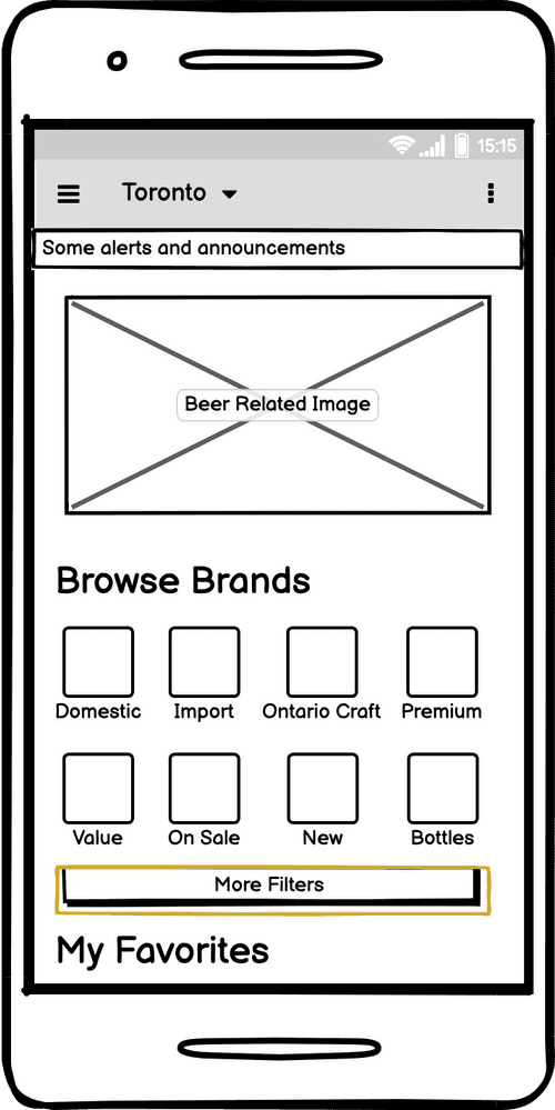
A “More Filters” button lands right below the category grid: advanced criteria, one tap from launch.
02
Popular categories pop-up
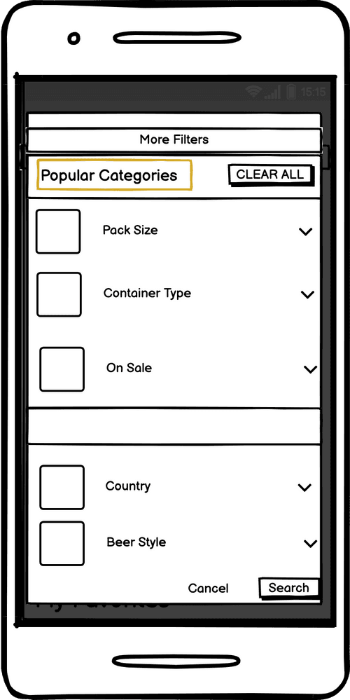
A pop-up sheet surfaces popular categories: multiple filters, no modal maze.
03
Second-level options
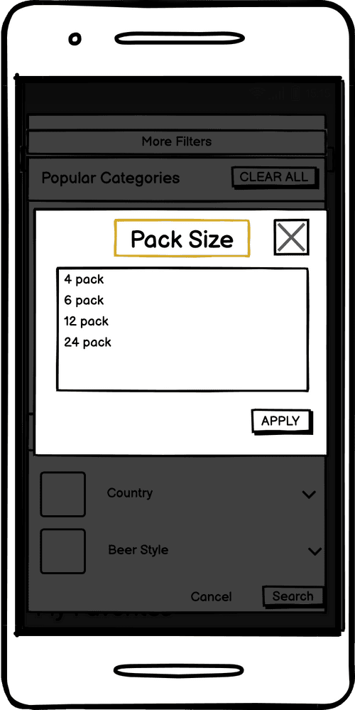
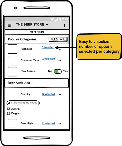
Each category drills down to its options: pack size, container type, beer attributes.
04
All filters applied
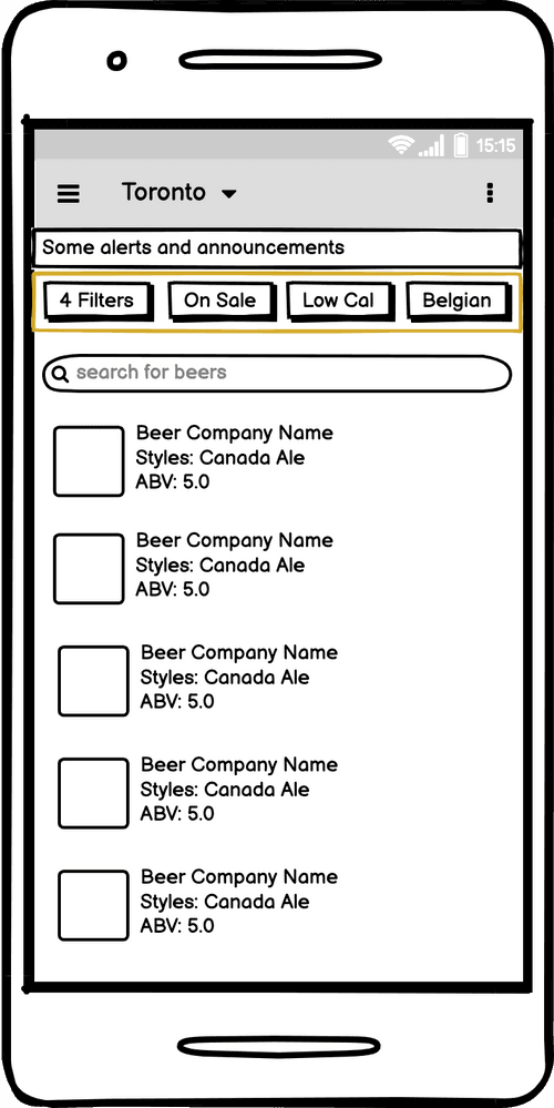
Applied filters stay visible above the results: the state of the search is never a mystery.
Testing Early, in Low Fidelity
I used Balsamiq as my wireframing tool to build initial mockups and get feedback early on. Internal users tested the flows and gave instant feedback, incorporated before any high-fidelity work began.
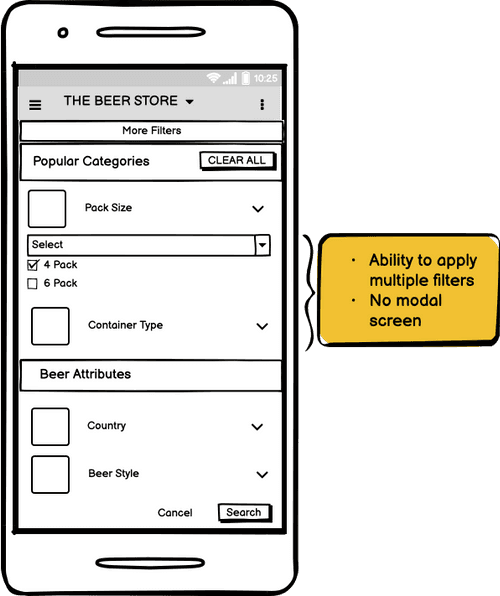
The Prototype
The final flow, stitched together: from the home screen to a fully filtered result list.
Learnings & Key Takeaways
No Such Thing as Over-Communication
Research & Testing
The one-week timeline didn’t leave any breathing room to approach the problem with deeper research and testing.
Given more time, I’d love to run usability testing with real users to avoid any assumptions made in the process.
Communication
I was constantly in touch with product managers, designers, and developers to ensure the feasibility of my designs, and I will continue to do so in every project.
Constant contact with every stakeholder is what kept a one-week project feasible: the designs shipped because nobody was ever surprised by them.